Layout Guidelines
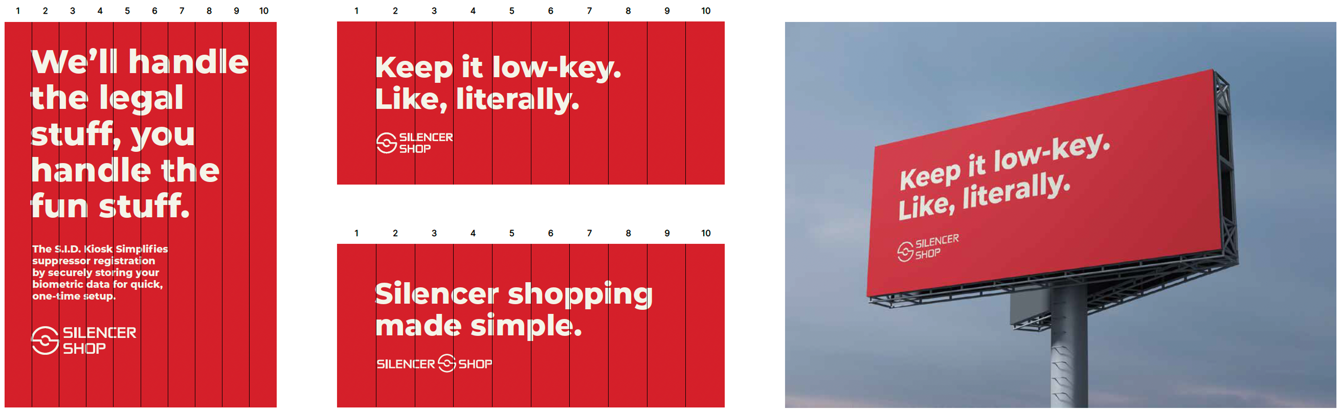
Our grid layout is built on a ten-column system, designed for flexibility and balance. The first and last columns are reserved exclusively for margins, giving your design room to breathe. These margins should always equal 10% of the total width, ensuring consistency across all materials.
This grid keeps everything looking sharp and well-aligned, while maintaining a clean, structured layout that complements our products without distraction. Use it to keep things organized and visually appealing, no matter the content.
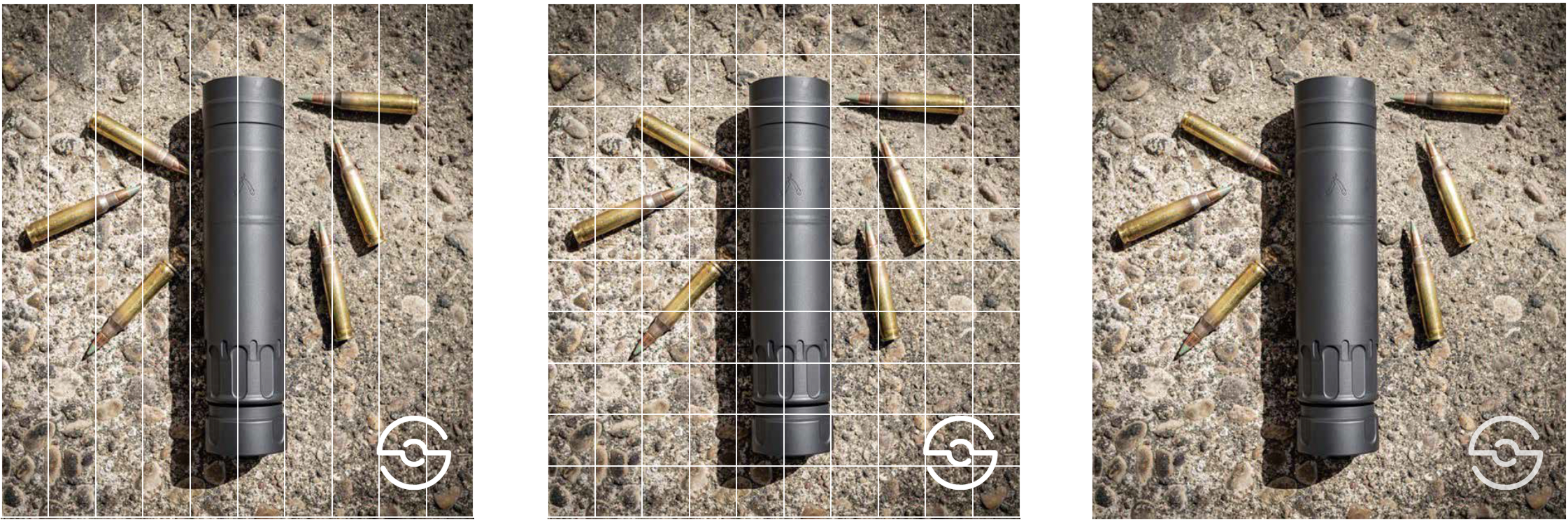
Watermarks
When it comes to watermarks, we’re going for subtle but structured. Use a repeating grid to avoid things feeling overly rigid, with 10 rows horizontally to keep the flow natural. Focus on the bottom-right corner where the watermark can live comfortably—create a square that takes up 20% of the space.
The Silencer Shop icon should fill 75% of the square’s height and width, sitting there like a silent guardian. Set the opacity to 75%, so it’s noticeable but doesn’t steal the show. The result? A sleek, professional watermark that reinforces the brand without overpowering the design.