Photography
Our photos tell stories. The stories often involve people having a good time shooting guns, but it’s important to catch details and moments that folks in the know would pick up.
We take great care in selecting our products so our imagery should also look as
carefully crafted. Solid colors with subtle gradients paired with high contrast visuals of our products help the craftsmanship sing in the photos.
In product shots, we should try to tell stories in how we group our products and what graphics we add to them.
Photography Style
- Embrace natural lighting to create alived-in feel without artificial setups.
- Use shallow depth of field to make the subject stand out and keep the background complementary.
- Use familiar settings that reflect our customers’ lives , whether out in nature or ranges, etc.
- Keep the styling casual and authentic, cool but not obnoxiously hip.
- Use vibrant but natural colors while maintaining an organic, realistic tone.
- Subjects should be relaxed and unposed. The camera is a participant and not their focus.
Photography Do’s and Don’ts
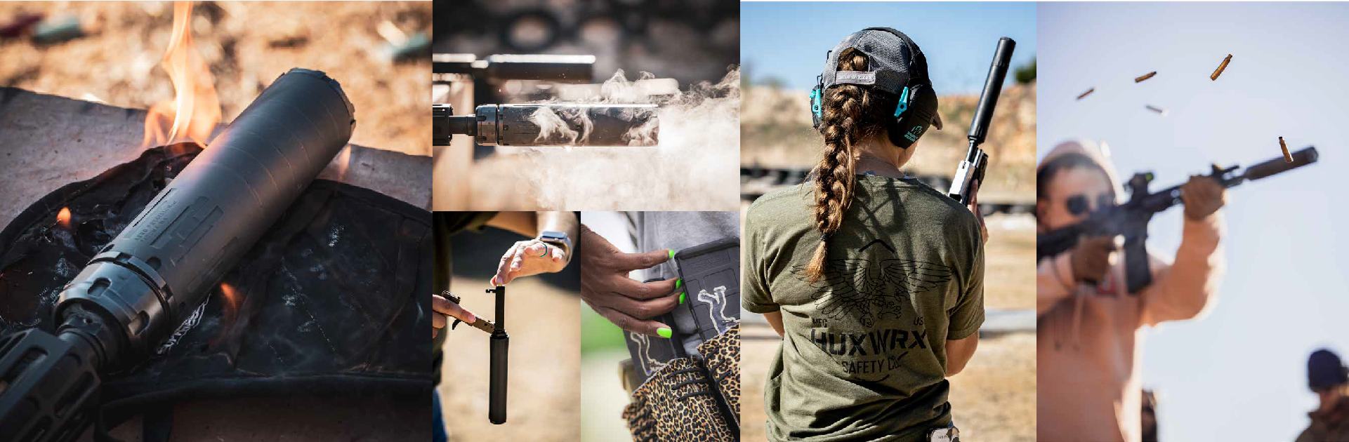
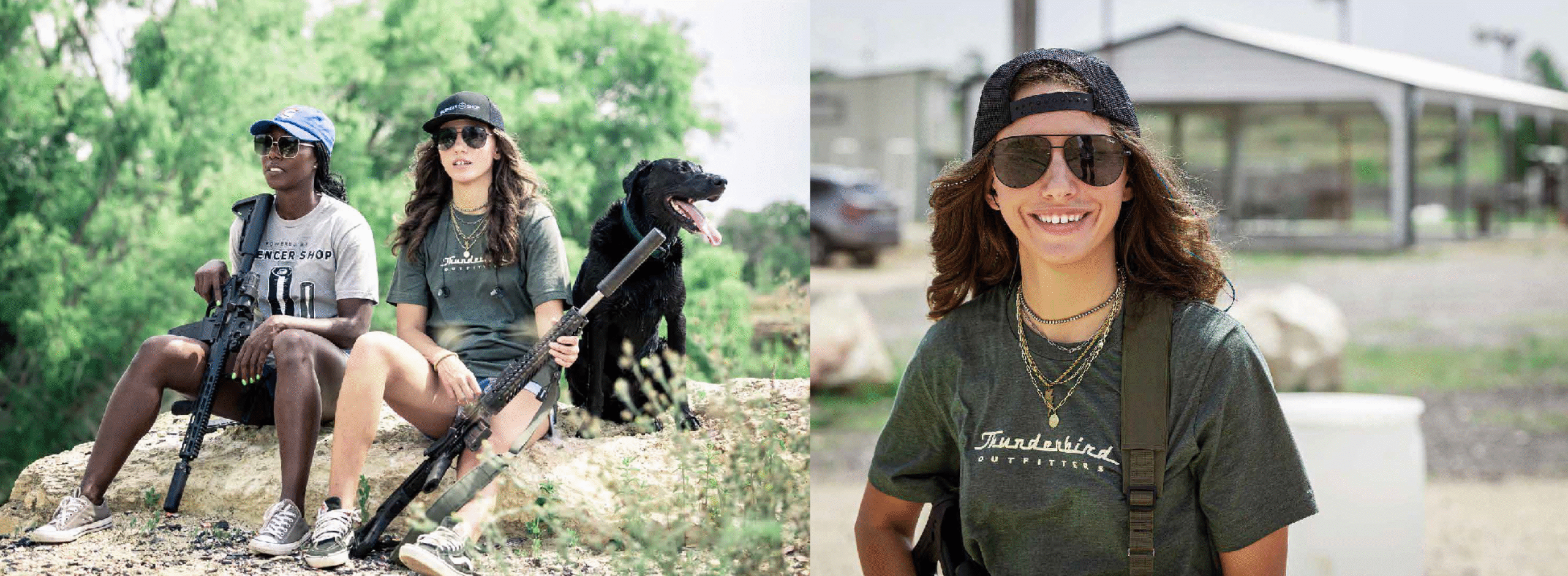
Do: Keep it genuine. Use real people doing real things with silencers. Let’s see shooters in action at ranges, hunters out in the field, and the gear being cleaned, prepped, or shown off in everyday use. Lighting should be natural—think outdoor golden hour or rugged indoor setups with a moody edge. Silencers are the star, but they’re part of a bigger picture: the experience.
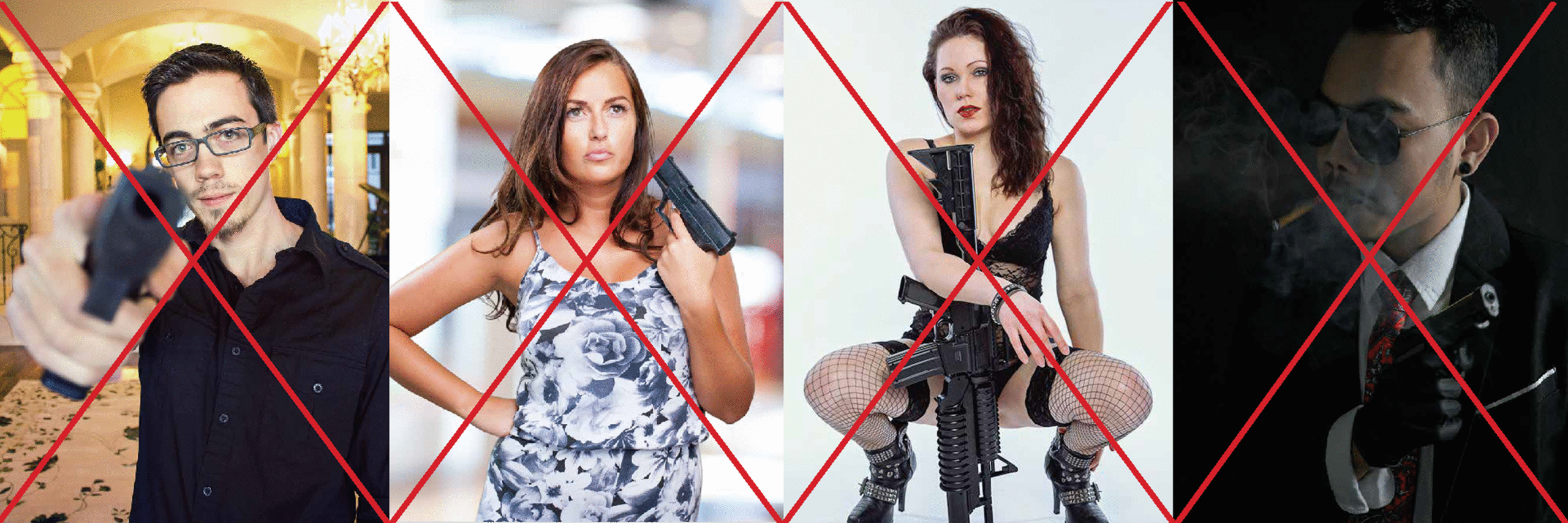
Don’t: No fake smiles, no forced action shots. Overly staged, heavily edited, or filtered photos are out. We don’t want it to look like a stock photo from 1999. If it feels too posed or “perfect,” scrap it. And absolutely no cheesy “guns blazing” imagery-leave the Hollywood action movie clichcés where they belong.
Stock vs Custom
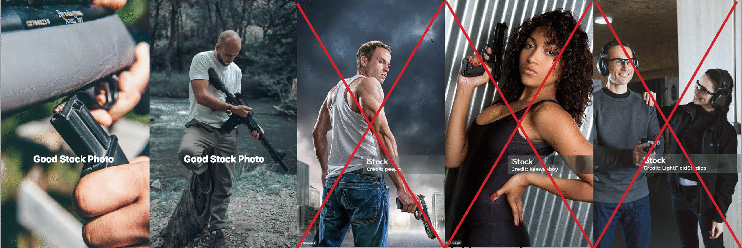
Custom: Whenever possible, we shoot our own stuff. Nothing tells our story better than our people and our gear in action. Our audience can spot a stock photo from a mile away, so we avoid them unless absolutely necessary.
Stock: If we must use stock images (and we’d really rather not), they have to feel as close to custom as possible. Avoid generic, bland, or overly polished shots. The focus should be on gritty, real-world applications of silencers—nothing that looks too commercial or too staged.
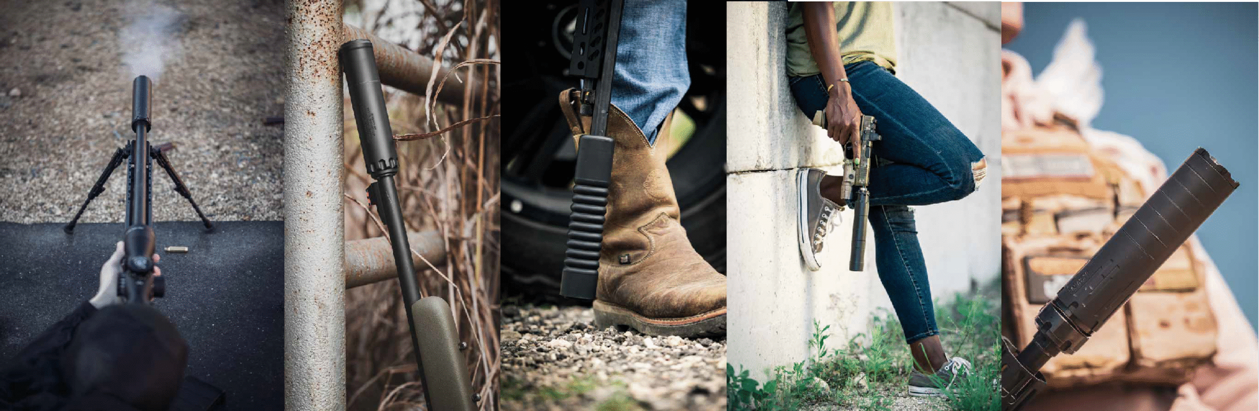
Image Treatment
Our photo treatment keeps things cool and collected. We want high contrast to bring out the details—sharpening the edges of our silencers, the gear around them, and the environments they’re in. Our brand photos should have a signature look: tough, stylish, and unfussy.
Color: Slightly desaturated with natural tones. Keep it moody and bold, but never oversaturated.
Contrast: High-contrast images that pop but don’t look over-processed. Keep details sharp.